2021
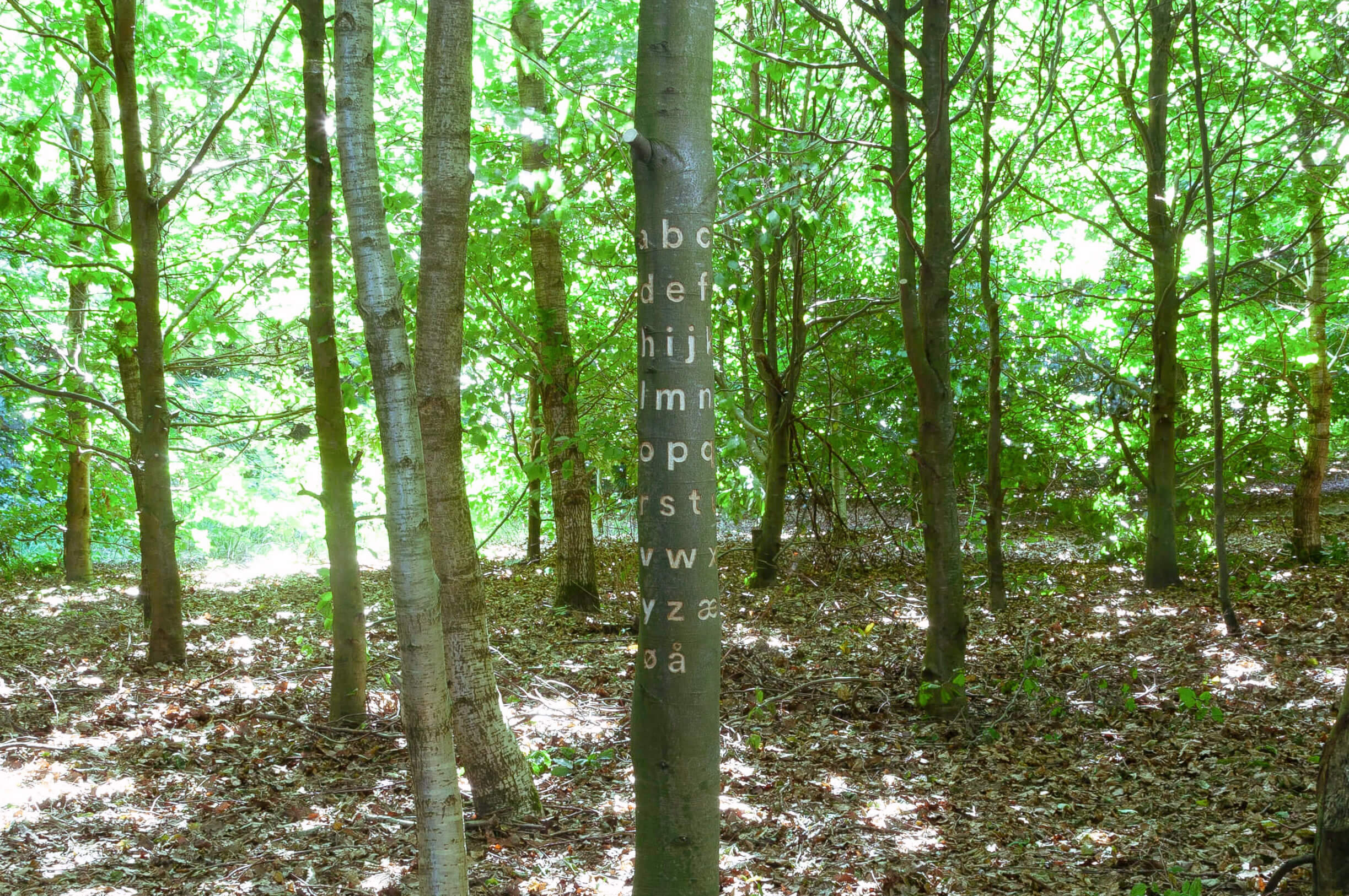
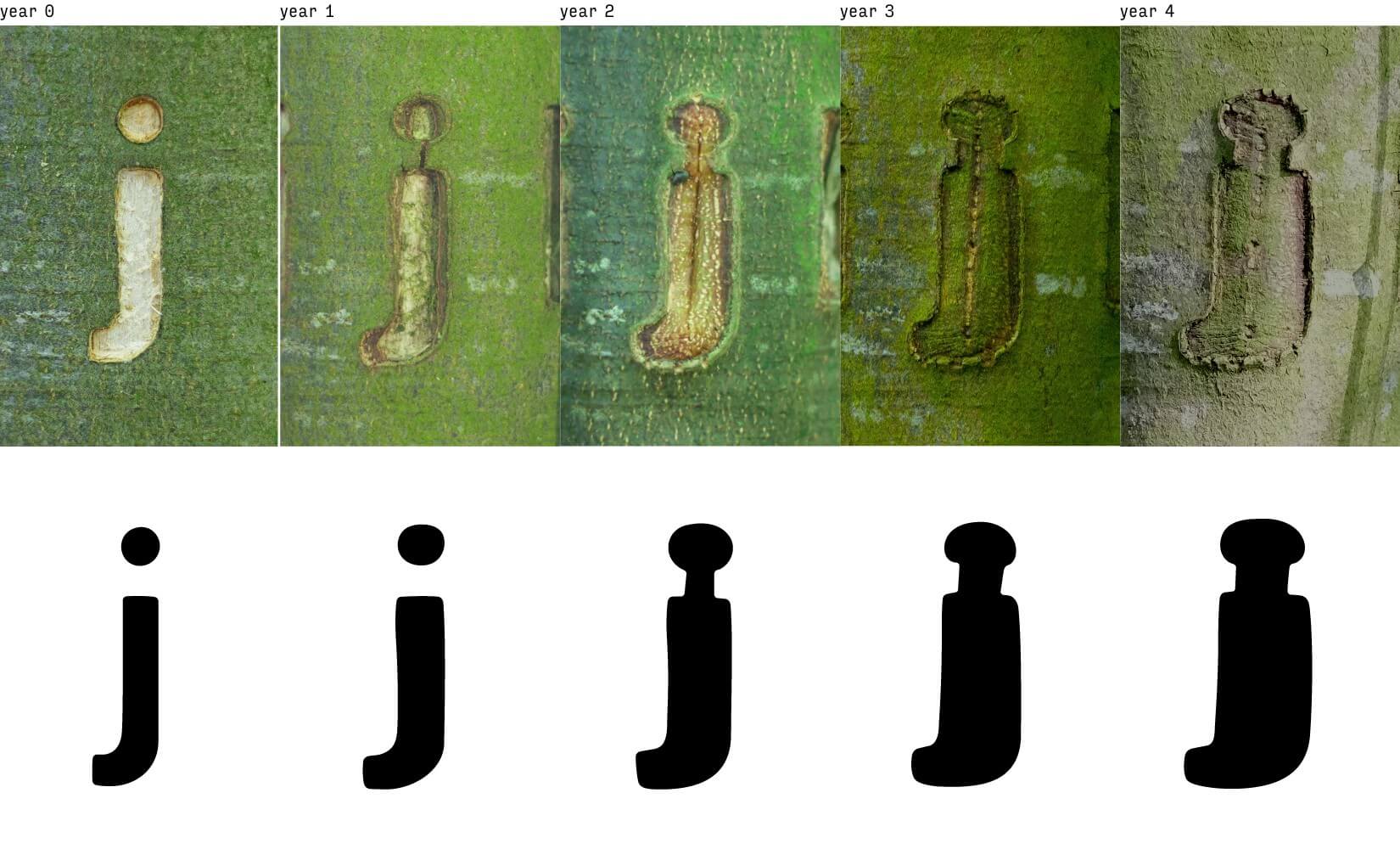
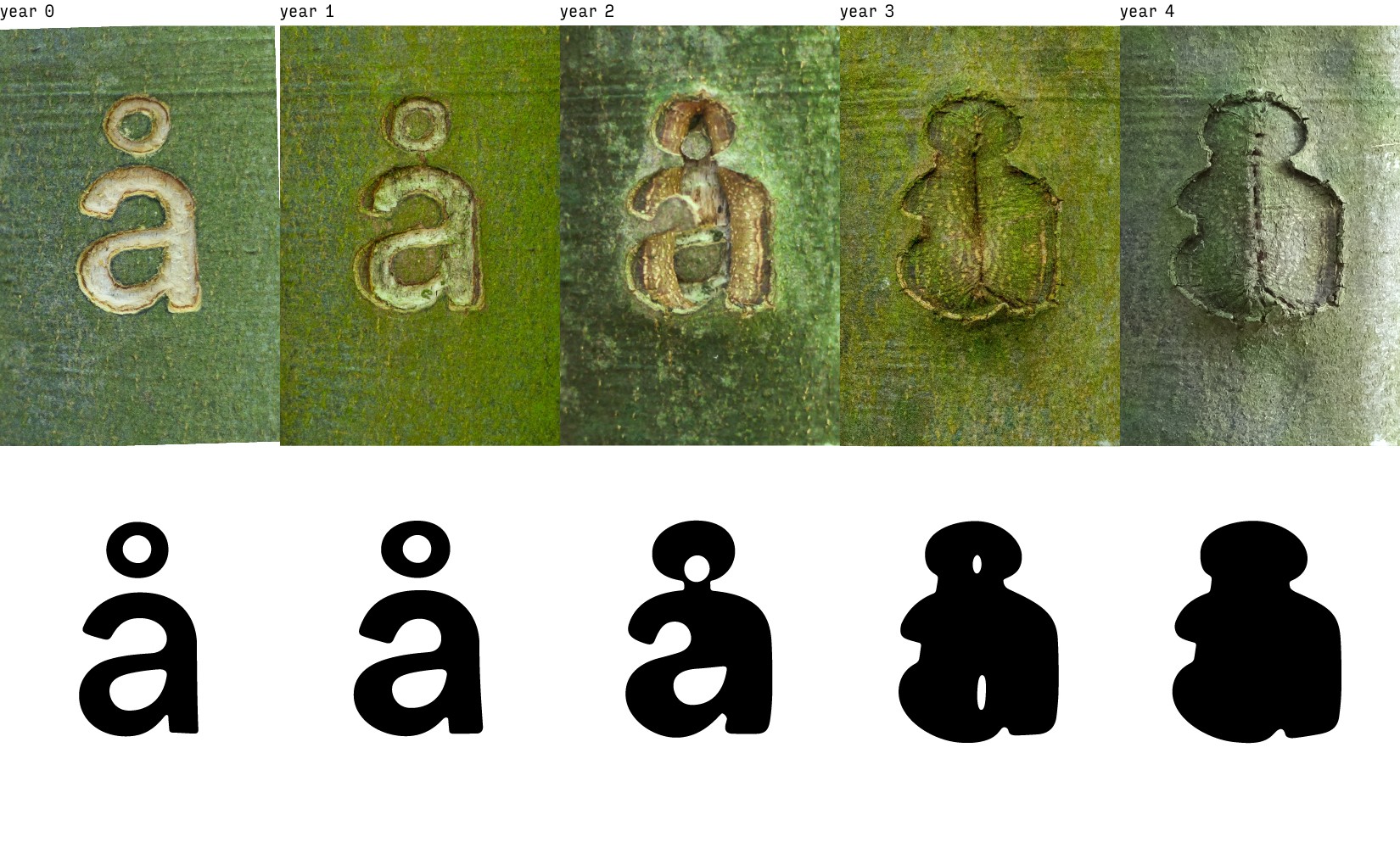
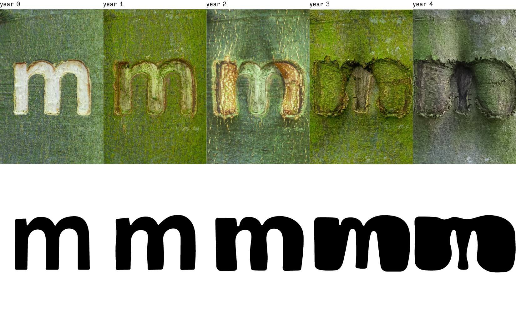
Occlusion Grotesque is an experimental typeface that is carved into the bark of a tree. As the tree grows, it deforms the letters and outputs new design variations, that are captured annually. The project explores what it means to design with nature and on nature's terms.
Chapter two, Deep Occlusion, explores the typeface as a dataset for an AI to learn how a tree grows and designs shapes over time.
In this project, the roles have been flipped, as nature is given agency to lead the process, and the designer is invited to let go of control and have nature take over.
It starts with the designer's handover to the tree by tracing and carving an initial typeface. Conceptually this initial type design refers to the desire for control, a man-made almost mechanical sans-serif typeface in high contrast within the natural environment. The tree is now left untouched for a year, where the natural processes such as occlusion begin. A tree’s occlusion is the process whereby a wound - or in this case carvings - is progressively closed by the formation of new wood and bark.
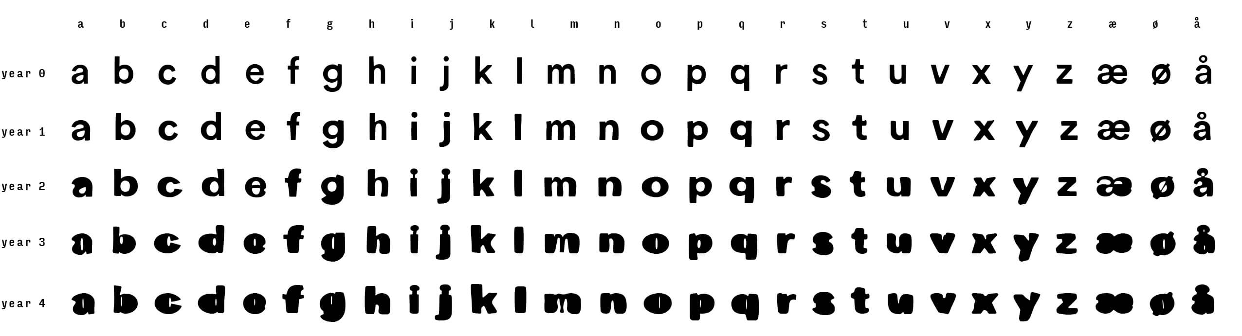
Returning to the tree reveals an unsupervised transformation that is unique to each letter of the alphabet. The artist now takes on an observant role and meticulously documents the letters with a camera and measurement tools. This is repeated every year with the important detail that the camera settings, lens, distance, and measurements stay consistent at every observation.
The digitalization from the tree to a usable font invites the artist to become the design interpreter. For the most part, the letters can be traced, but occasionally due to unexpected bark behaviour, edge cracking, and blurring of boundaries, the artist has to take decisions without diverting from the tree's intent.

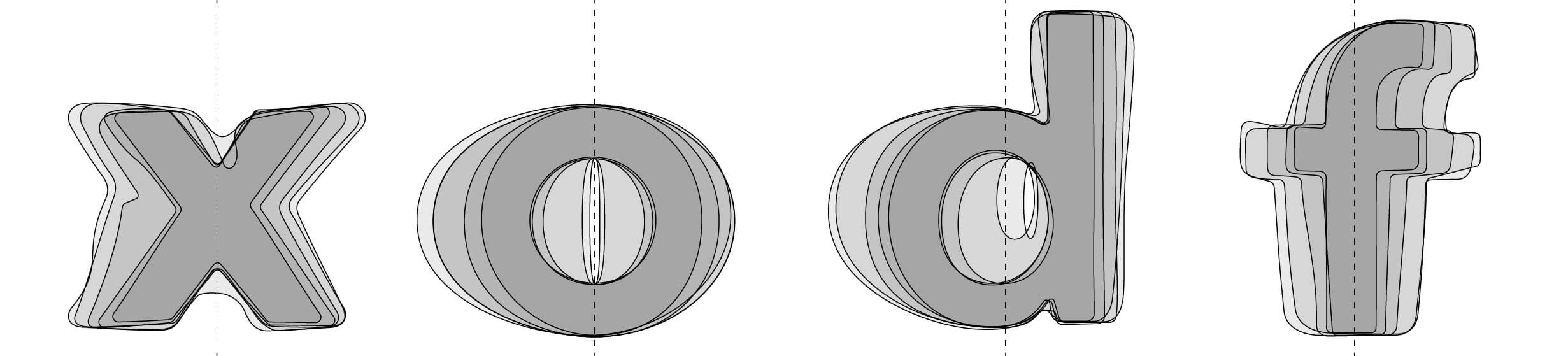
One of the beautiful coincidences between the growth of a tree and type design is that growth happens sideways. This was new to me but seems obvious now. Already 3 years in, the letters were clearly showing expansion to the left and right, while the position from the ground had not changed. This is due to the misconception that trees do not grow from the ground up, but rather out from the tips. As new branches reach higher into the sky, the lower trunk grows radially from within. While this happens, the inner- and outer bark stays wrapped around the trunk performing an extraordinary expansion, thus deforming the surface. All while keeping the tree protected.
In typography, as we "grow" the typeface into bolder and heavier weights, we design each letter sideways too. Letters gain more graphical volume left and right while keeping the x-height more or less consistent. A coincidence that makes a tree the perfect candidate to design a typeface.
Nature is never perfect and will never produce two of the same. Another interesting attribute that aligns with an ever-growing need to create unique designs, free from norms and human-biased conventions.
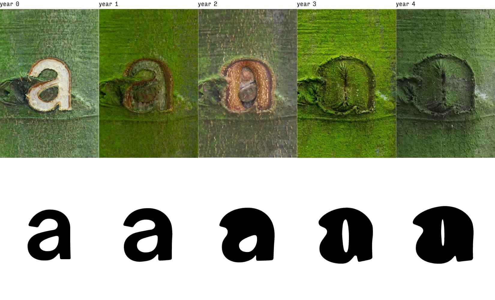
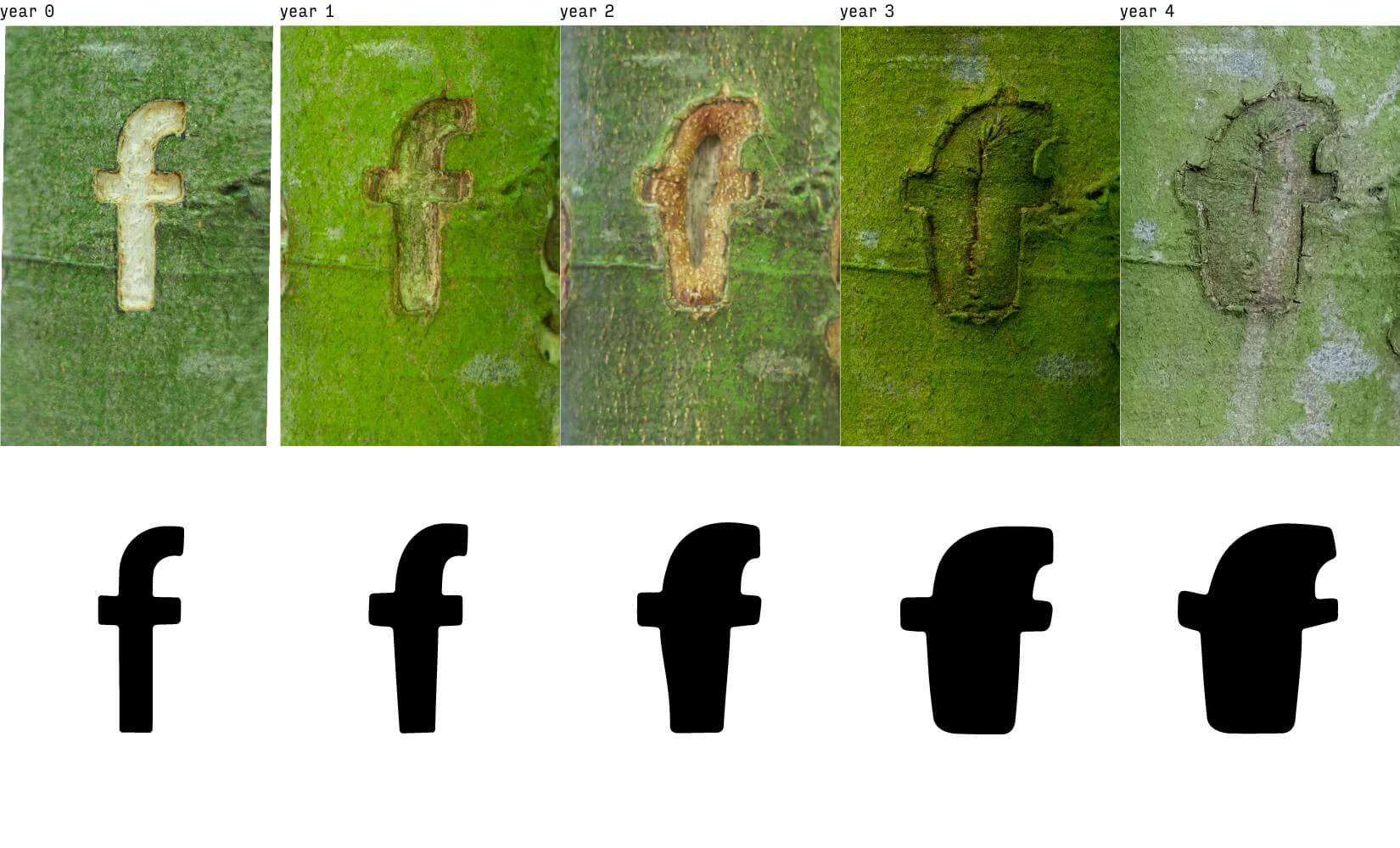
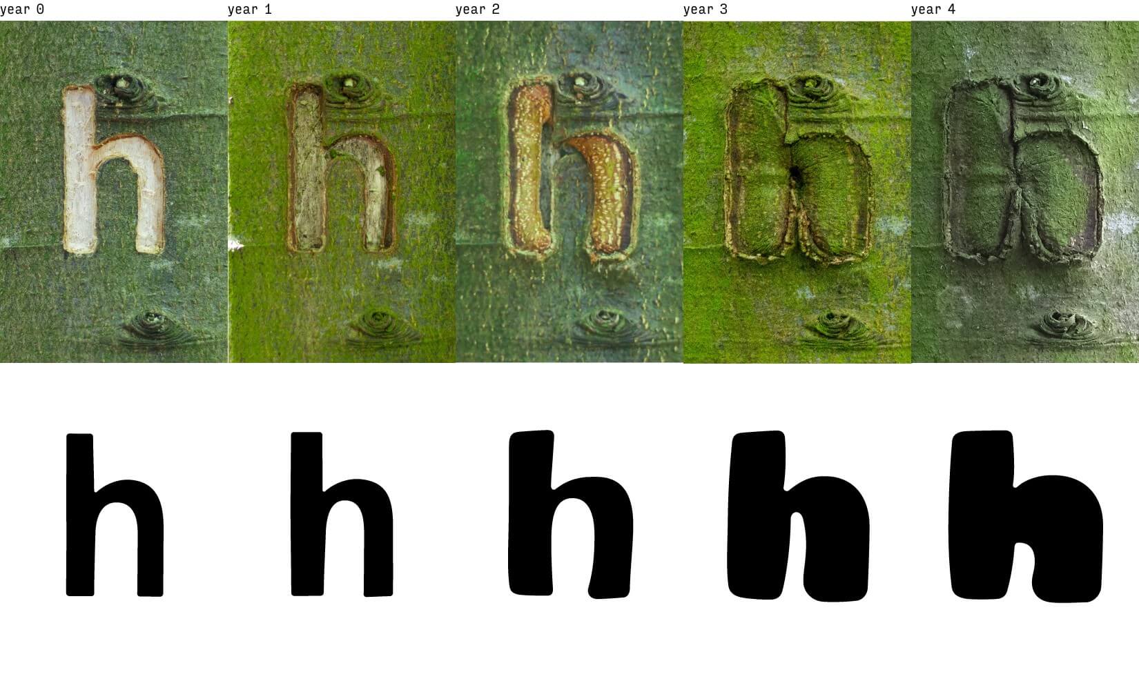

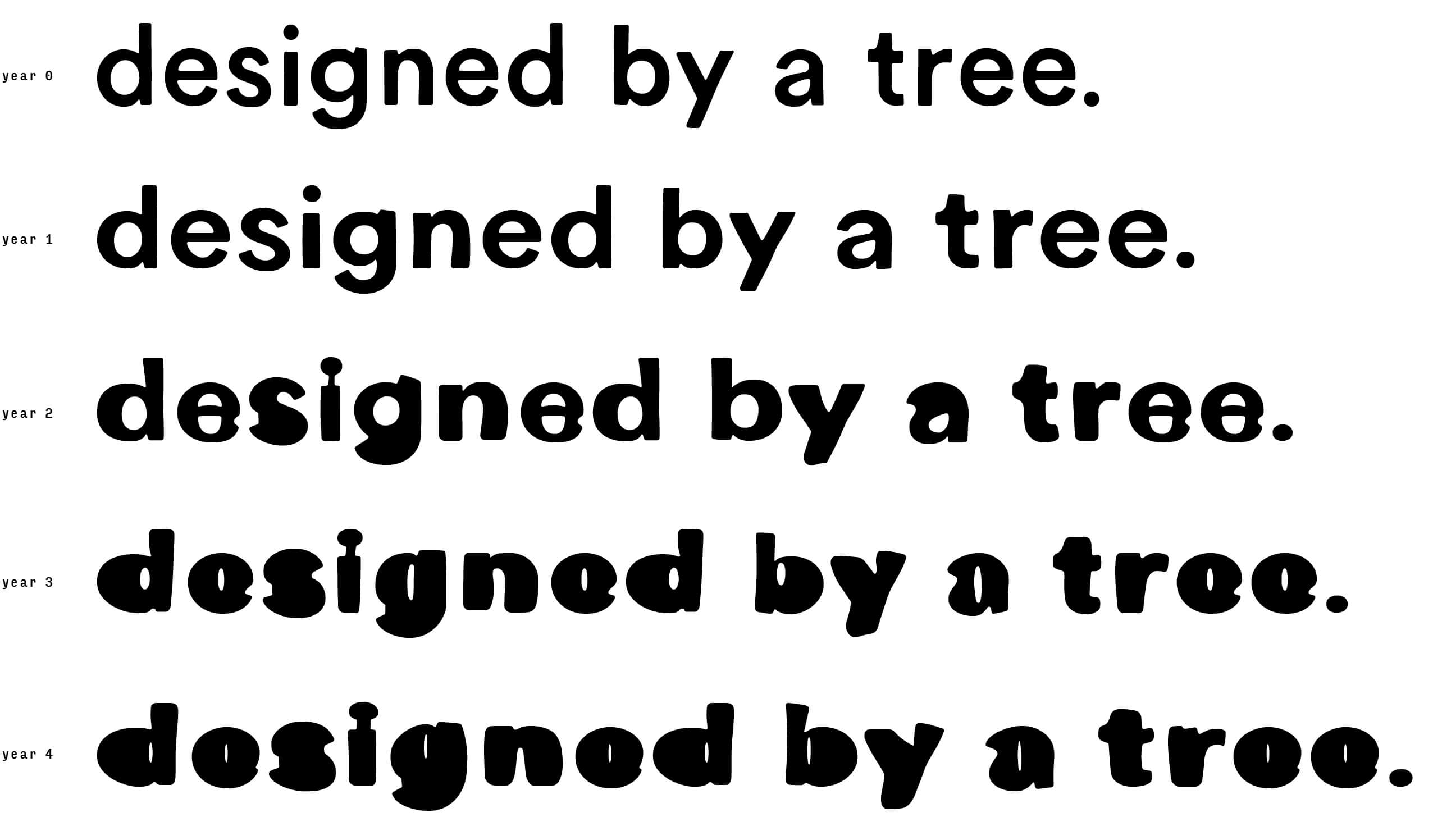
Occlusion Grotesque does not follow the conventual weights, (eg. light, medium, bold) but rather each weight represents a year of growth. Year 0 for example is referred to both the ‘regular’ weight and the beginning of the project in 2015. Year 5 was captured in 2020. For the most dramatic annual changes a younger tree was desired, but since carving in the bark can be painful and potentially kill the tree a resistant sort and age was chosen.
The tree of choice was a Beech, native to the forest of my parents. It was planted by them in 1997 in Ågård, Denmark. At year 0 only a quarter side of the tree was used to carve the letters, maintaining the tree's ability to transport essential nutrients from the leaves to the roots. It is important to note that cutting through the bark of a tree trunk in a complete circle will kill the tree. No trees were harmed in this experiment.
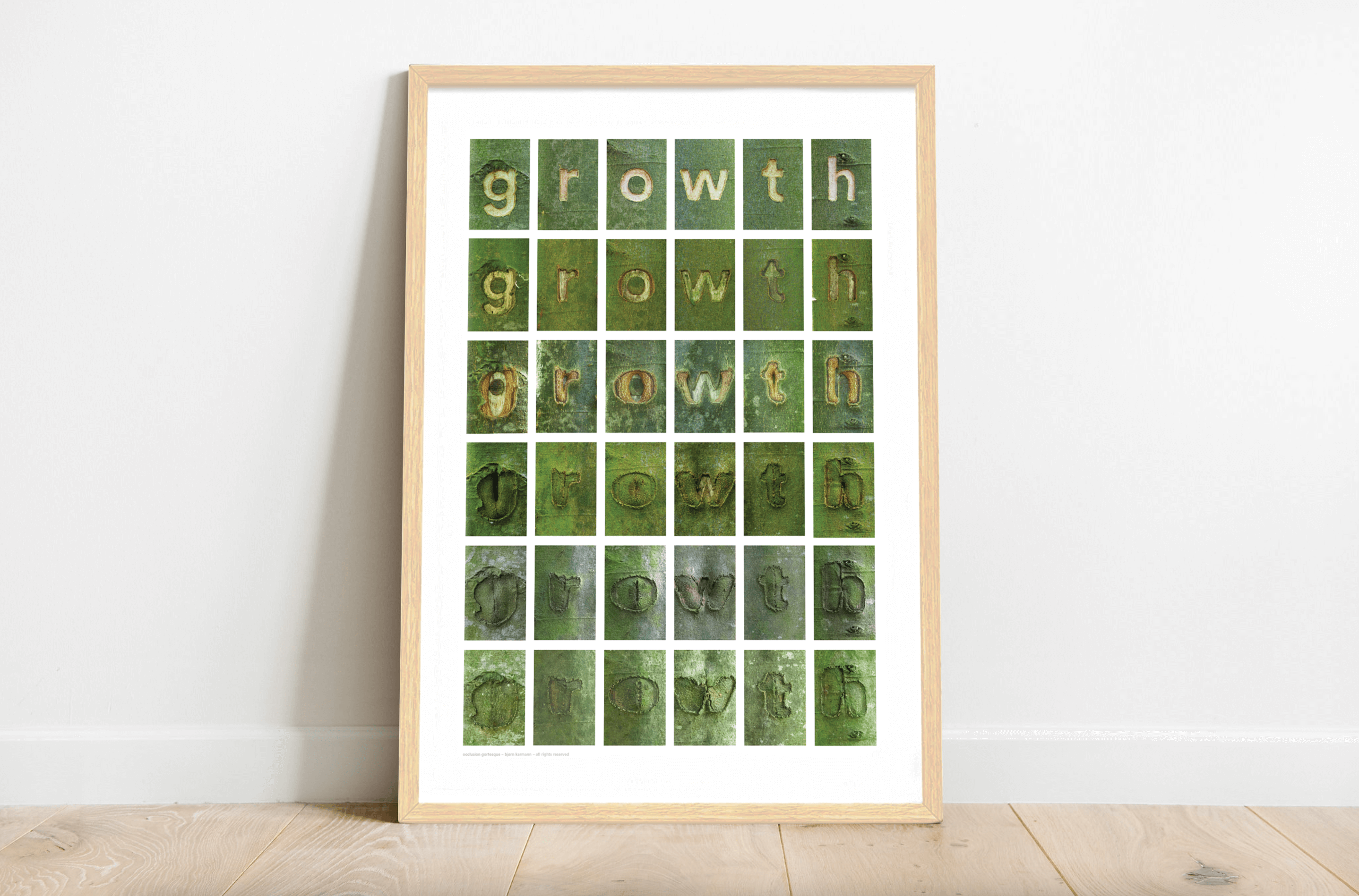
To celebrate the tree's design and support the project, some of the most surprising outcomes have been converted into graphical posters.
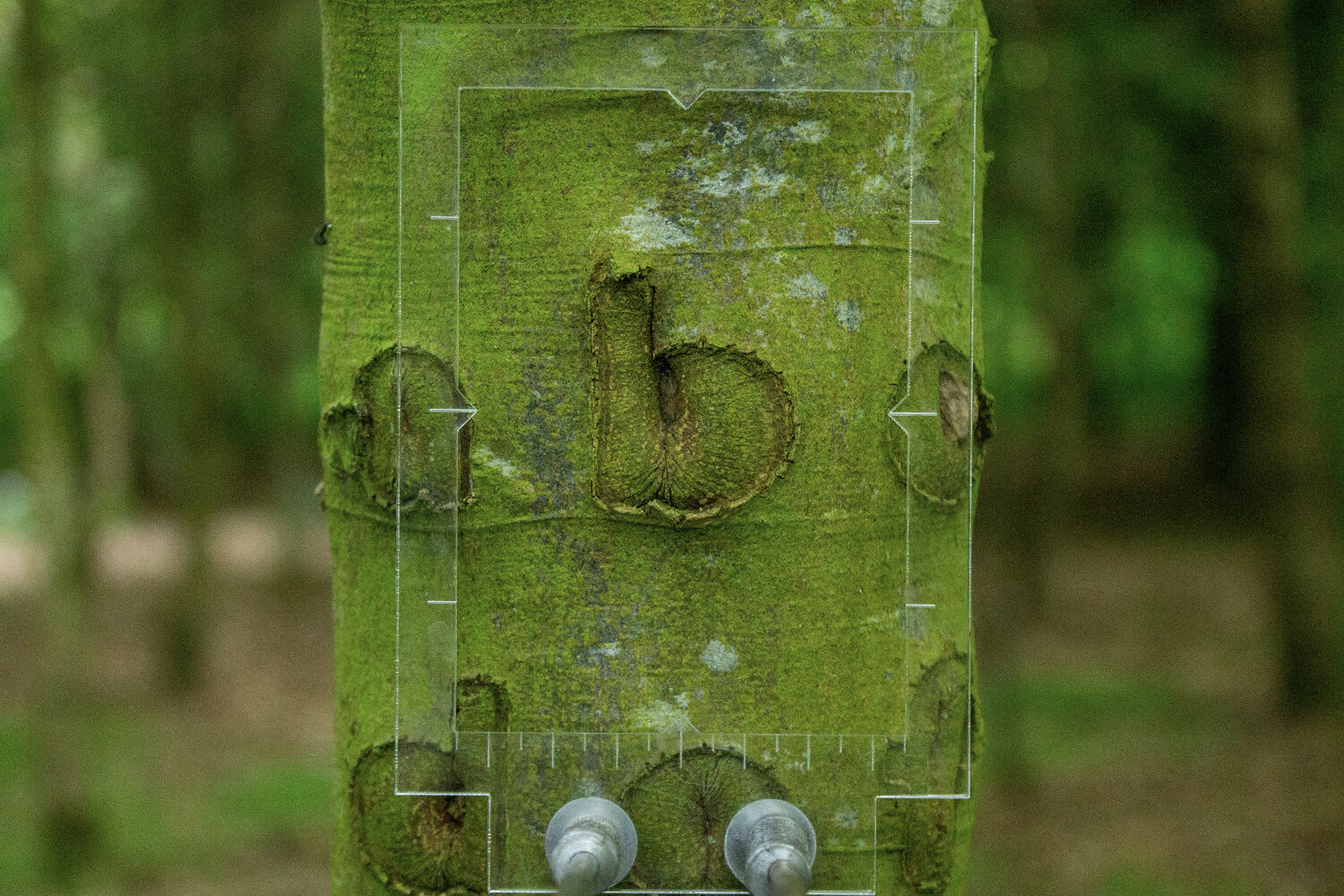
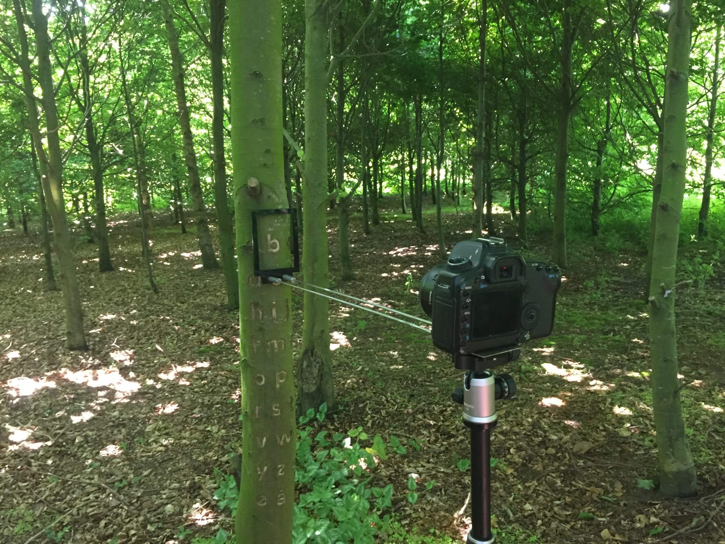
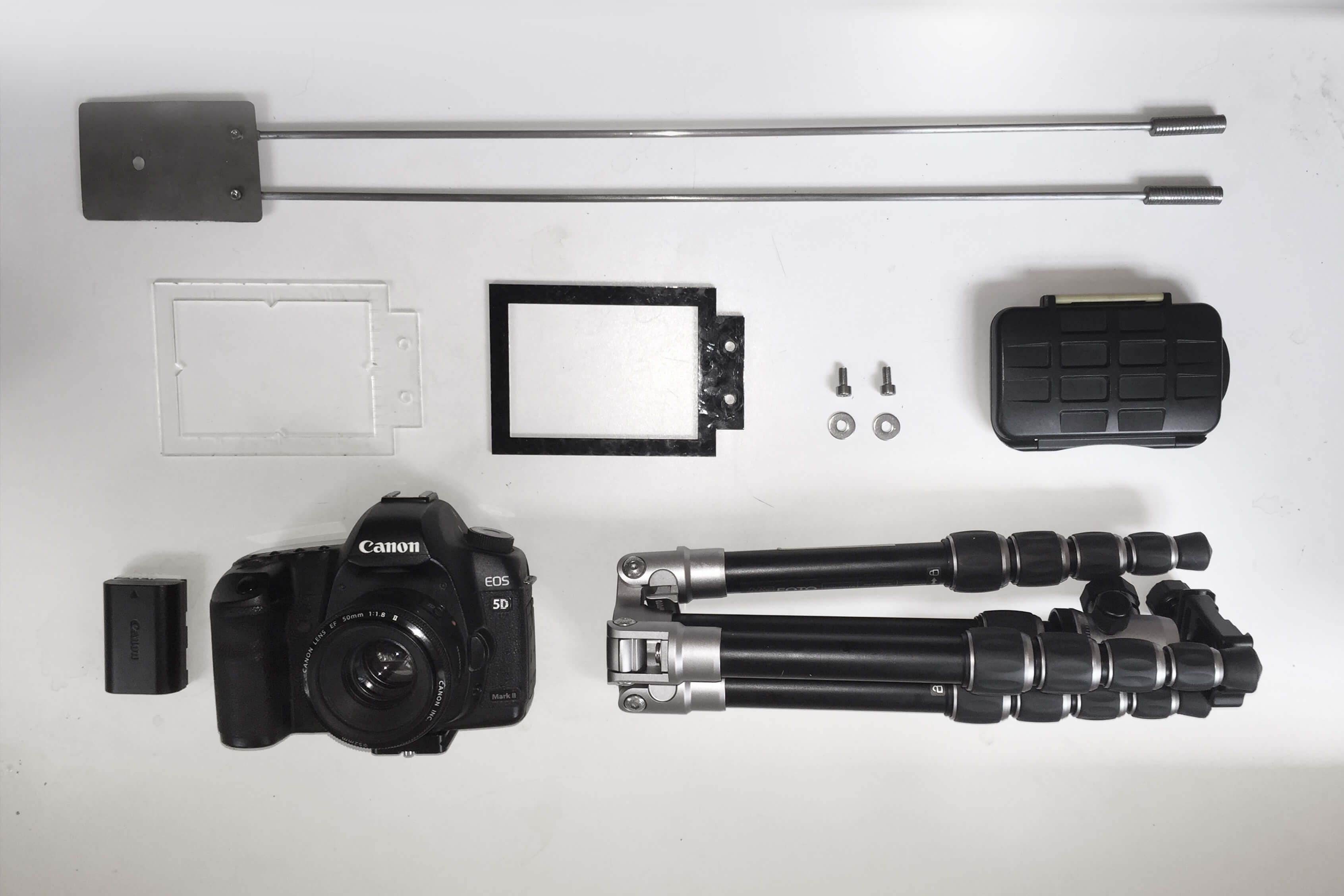
One of the key documentation tools was a laser-cut frame that attaches to the camera. The frame served as the known absolute measurement that is used to reference scale over time. In the frame is a 60mm ruler engraved, indicating every 5mm with a line. Secondly, the tools help with camera distortions. If necessary the square frame at a 3:4 ratio can be aligned back into a pixel-perfect 3:4 square format, correcting any lens distortion made by a given lens. The steel poles ensure a consistent distance from the camera sensor to the tree, again helping with minimizing distortions.
The image above shows an overview of tools used for documenting the letters consistently across multiple years.
a: steel rods (for consistent distent)
b: plexiglass frame w/ ruler
c: waterproof data storage
d: M4 bolts for assembly
e: canon 5D MkII full-frame camera
f: tripod
The rigorous camera setup allowed for insight into the growth rate and direction of the tree, since each year was accurately framed a centre axis could be triangulated.
The image above shows some of the letters that clearly reveal a sideways growth, and even a curious tendency to grow to the left of the centerline.
Selected Works

Project AliasProject type
Terraform TableProject type
Occlution GrotesqueProject type

TrajectoriesProject type

PyrographProject type

ParagraphicaProject type

ObjectifierProject type

UAE PavillionProject type
CIID NetworkProject type
News GlobusProject type
Discharge NoiseProject type

AbstractProject type